i found this informative article on the knot website. i didn't realize there'd be so many "hands," as they call it. interesting! read on...
Calligraphy: 18 Popular Styles
From the traditional to the whimsical, calligraphy can be created in many shapes and styles. Whether you choose sumptuous curves or sophisticated lines, the calligraphy on your invitations -- and envelopes, menus, place cards, table cards, maps, programs, guest books, wedding favors, and notes for out-of-towners -- adds a personal touch that reflects the tone of your event. To help you find the lettering that best suits your wedding, we've collected 18 of the most frequently used "hands," or writing styles.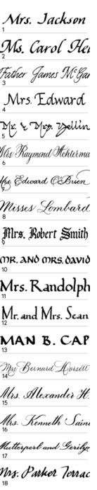 1. ITALIC. By far the most popular hand, this elegant yet simple style looks good on any paper. Italic letters slant upward to the right and are based on an oval shape, with the width of the letters usually half of their height. Created with a broad-tipped pen, the clean, crisp line can dress up to announce an ultra-formal Saturday night affair or dress down to set a more casual mood for a Sunday afternoon garden wedding. What makes this hand so pretty is the alterations between the thick and thin lines made by the pen. Variations are endless, and Italic can be matched easily to complement many typefaces. (This is helpful if you want to mirror the typeface on your invites, for example.)
2. CHANCERY ITALIC. Slightly sharper and more formal than traditional Italic. The capital letters, like the M, C, and H in this example, are more decorative.
3. SCROLL ITALIC. One of the most formal hands, Scroll Italic is a simplified adaptation of Spencerian (see below) and resembles cursive handwriting.
4. STRAIGHT ITALIC. This hand falls between Italic and Roman styles and is recognizable by its vertical, rather than slanted, letters -- most noticeably in the capital E and lowercase d in this example.
5. FLOURISHED ITALIC. This Italic is enhanced with a calligrapher's personal touch. Note the exaggeration on the finish of the letters, as well as the slanted word "and."
6. COPPERPLATE. Written with a pointed pen that is hand-dipped in ink, this style uses pressure to create delicate thick and thin lines. Traditional Copperplate sets a romantic mood and is popular for addressing envelopes. Developed in Europe during the 17th and 18th centuries, this is a true calligraphic hand and one of the most graceful, lending itself easily to flourishes (it's the lettering on the Declaration of Independence). Copperplate is also one of the most difficult alphabets for a calligrapher because of the method of writing (the slow process of applying and releasing pressure on the nib) and therefore tends to be the most expensive. As with Italic, there are endless variations, and Copperplate can be matched easily to complement many typefaces.
7. ROOK COPPERPLATE. "Rook" is hand lettering made to resemble a printed typeface. It represents a variation on the traditional Copperplate, with a slight difference in the capital letters (a bit more round in the accents -- see the exaggerated curls of the capital M and lowercase n).
8. SLOOP COPPERPLATE. "Sloop" is also a term taken from printed type and shows another variation on the traditional Copperplate. In this hand, the capital letters have elongated curves in the accents; see the sweeping motion of the capital M and L and the lowercase r and d.
9. GOTHIC. Also called Old English or Blackhand, this is a very formal hand. Written using a broad-tipped pen, Gothic is perfect for a theme or period wedding and works well with similar or matching print typefaces (on your invites, for example).
10. UNCIAL. Uncial is one of the oldest styles of handwritten alphabets and is a nice alternative to Italic. Based on Irish calligraphy, it works well with an Irish theme. This alphabet is mostly all caps, with the letters all about the same height and width. Uncial is very rounded and stylized, offering a traditional yet contemporary look. Produced with a broad-tipped pen, it is straightforward and elegant and also works well matching simple print typefaces.
11. ROMAN. A very classic hand with a clear round alphabet, Roman is less formal than its related print typeface. This hand is best suited for bridal showers and other casual parties. Its small serifs dignify diagonal stroke letters such as capital R as well as straight letters such as capital M and lowercase p. The lower case is half (and sometimes a little more) the height of the capitals. Developed by Italian scholars in the 14th century, Roman lettering is one of the most recognized of all styles.
12. ANTIQUE ROMAN. A variation on the traditional Roman, Antique Roman has capital letters that are much taller than the lowercase. This stately hand also has extended vertical strokes on the ascending and descending letters; see the capital M and S.
13. ROMAN CAPITALS. Similar to traditional Roman but in all capital letters. Roman capitals are the foundation of our modern-day alphabet, derived from the style of Roman scribes and stonecutters, which developed into the very common Roman typeface.
14. SPENCERIAN. This is another example of a true historical calligraphic hand. Ornate and flourished, Spencerian is an offshoot of Copperplate and dates back to the 18th century. Created with a pointed pen, the thick and thin lines create sophisticated letterforms and rhythms within the script. Spencerian is traditional, formal, and very easily matched to a printer's font. Spencerian has many variations depending on the scribe; it is the most varied of all the hands since there is no "set" alphabet for calligraphers to follow.
15. LONDON. London is hand lettering made to look like a printed typeface. Based on the Spencerian hand, it is beautifully classic, formal, and readable. It can be scripted with or without loops on the ascending letters, such as the lowercase l and d.
16. ST. JAMES. St. James is also hand lettering made to look like a typeface. Based on the Spencerian hand, St. James is refined and smooth. The ascending and descending letters (capital M and S) are unlooped and finished quite distinctly with a blunt stroke, creating a formal look.
17. VENETIAN. An offshoot of St. James, this is also hand lettering developed to resemble a typeface. The ascending and descending letters in Venetian (capital G and lowercase l and y) are looped with traditional cursive-style strokes.
18. HAMILTON. This is an example of a hand developed by an individual calligrapher. Calligrapher Glorie Austern created this script -- more of a handwriting style -- using the lowercase form for capital letters. This is a style similar to basic cursive -- it's fun and is readable, like Italic.
Resources:
Glorie Austern, The Calligraphy Co., Secaucus, NJ (hands 1, 11, 12, 13, 15, 16, 17, 18)
Lisa Bates, Calligraphy by Lisa, San Diego, CA
Nan DeLuca, Calligraphically Yours, New York, NY (hands 4, 8)
Joan Lite Miller Calligraphy and Illustration, Seattle, WA
Calligraphy by Melanie Roth, Scottsdale, AZ
Lisa Rottenberg Yellin Calligraphy, New York, NY (hand 5)
Lynne Sandler, Lettering by Lynne, Alexandria, VA
Pya Seidner, Guilderland, NY (hands 7, 10)
Kathryn Shaughnessy, Calligraphics, New York, NY (hands 2, 3, 4)
Marcella Wegiel, Dearborn Heights, MI (hand 9)
Hilary Williams, North Hollywood, CA (hands 6, 14)
Tuesday, April 26, 2005
on calligraphy
Subscribe to:
Post Comments (Atom)


0 comments:
Post a Comment